S-Sawasdee Plastic Logo


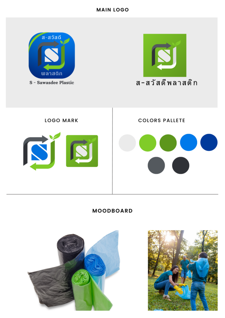
The design process began with in-depth discussions to understand the brand identity and target audience. Since the brand initially did not have its own Brand Color or logo, we took on the task of creating a cohesive Brand Color for S-Sawasdee Plastic.
We chose an Earth Tone color scheme to convey a natural and eco-friendly feel, as S-Sawasdee Plastic’s mission is directly connected to environmental conservation through the recycling of plastic bags. The main colors we selected were green, representing trees and nature, and blue, symbolizing the sky and water.
The logo design incorporates the concept of recycling, with arrows pointing towards each other to represent reuse. We opted for a classic font, simple yet suitable for a local industry like S-Sawasdee Plastic.
In summary, this design project is one that we are very proud of. If you’re looking for a distinctive and unique logo design like this one, the team at Digital Agency Bangkok Co., Ltd. is here to assist you.


