


Social Media Image Sizes: The Complete Guide





Social Media Image Sizes: The Complete Guide
A designer once summed up a common frustration perfectly: "I spent three hours making this graphic look perfect, and Instagram cropped my client's face out of it." That's not a rare mishap — it's one of the most common, entirely preventable mistakes in digital design, and it happens because canvas size is treated as an afterthought rather than the foundation it actually is. A brilliant design built on the wrong dimensions doesn't just look slightly off; it can get cropped awkwardly, blurred by compression, cut off mid-headline, or rejected outright by the platform it was meant for.
Canvas size might sound like a purely technical detail, but it sits underneath almost every visual decision a designer makes — where the focal point goes, how much breathing room text needs, what gets sacrificed when a platform inevitably crops or reformats an image for a different placement. Understanding canvas size isn't just about avoiding embarrassing crops. It's about designing with genuine intention for exactly where and how a piece of content will actually be seen.
This article breaks down why canvas size matters as much as it does, the specific dimensions that matter across major platforms, and how to think about designing for a multi-platform world without starting from scratch for every single placement.
Why Canvas Size Isn't Just a Technical Detail
Every Platform Displays Content Differently
Social media platforms, ad networks, and websites don't display images at a single universal size. Each platform — and often each specific placement within that platform — has its own dimensions, aspect ratios, and cropping behavior. A single image designed at one size and uploaded everywhere will look intentional on exactly one platform and awkwardly cropped, stretched, or letterboxed everywhere else.
Platforms Crop Automatically, and Not Always Predictably
Most platforms will accept an image that doesn't match their preferred dimensions and simply crop or resize it automatically to fit. The problem is that this automatic cropping often isn't intelligent about what matters in the image — a carefully centered headline can get sliced in half, a product shot's key details can get pushed outside the visible frame, and a face in a photo can end up cropped awkwardly at the edge of a circular profile picture. Designing at the correct canvas size from the start avoids leaving that outcome to an algorithm's guess about what matters most in the frame.
Aspect Ratio Affects How Content Physically Appears in a Feed
Beyond exact pixel dimensions, aspect ratio — the proportional relationship between width and height — determines how much space a piece of content actually occupies in a feed or timeline. A vertical, portrait-oriented image (like the 4:5 ratio common on Instagram feed posts) takes up more visible screen space while someone scrolls than a square or horizontal image does, which has a real, measurable effect on how much attention that content captures before someone scrolls past it.
Compression and Resolution Standards Vary Too
Canvas size isn't only about width and height — it's connected to resolution and file size requirements as well. An image built at the correct dimensions but exported at too low a resolution will look soft or pixelated once displayed at full size on a high-density screen. An image exported at too high a file size may get aggressively compressed by the platform itself, sometimes introducing visible artifacts or banding that weren't present in the original file. Getting canvas size right is part of a broader technical discipline that includes resolution and export settings working together.
Text and Focal Points Need Different Safe Zones on Every Platform
Many platforms — particularly video and Stories-style formats — overlay their own interface elements on top of content: profile icons, captions, engagement buttons, progress bars. A design that doesn't account for these overlapping elements risks having its most important text or visual details obscured by the platform's own interface. This is why designers work with "safe zones" — areas of the canvas kept clear of essential content specifically because platform UI elements are known to sit there.
Canvas Sizes Across Major Platforms
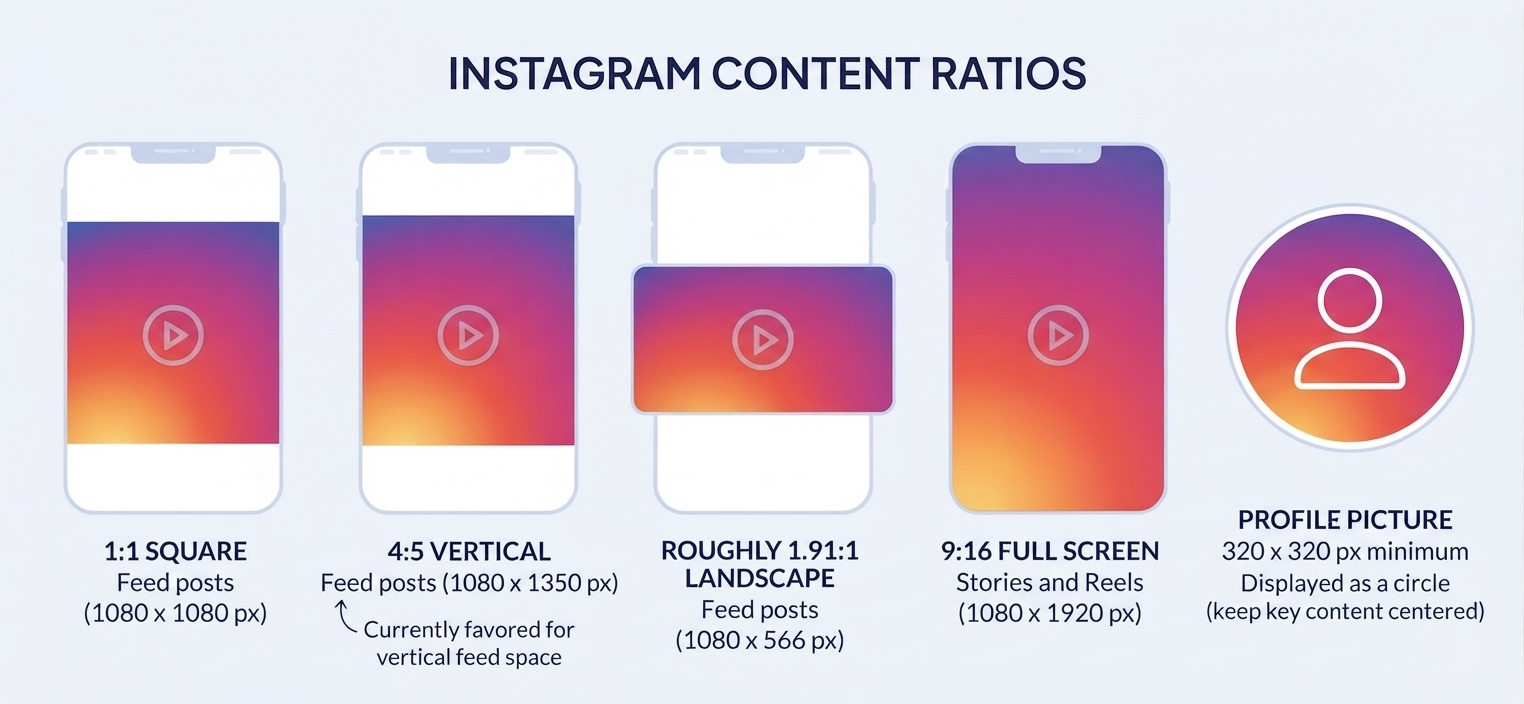
- Feed posts (square): 1080 x 1080 px (1:1 ratio)
- Feed posts (portrait): 1080 x 1350 px (4:5 ratio) — currently favored for taking up more vertical feed space
- Feed posts (landscape): 1080 x 566 px (1.91:1 ratio)
- Stories and Reels (full screen): 1080 x 1920 px (9:16 ratio)
- Profile picture: 320 x 320 px minimum, displayed as a circle, so keep key content centered
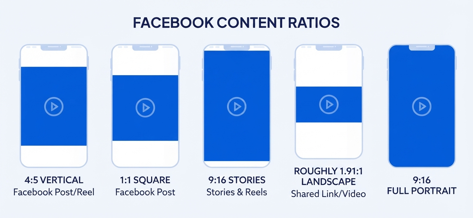
- Feed image posts: 1200 x 630 px (roughly 1.91:1)
- Cover photo: 820 x 312 px on desktop (displays differently on mobile, so centering key content matters)
- Profile picture: 170 x 170 px displayed size, though a larger source file is recommended for clarity
- Stories: 1080 x 1920 px (9:16 ratio)
- Event cover image: 1920 x 1005 px
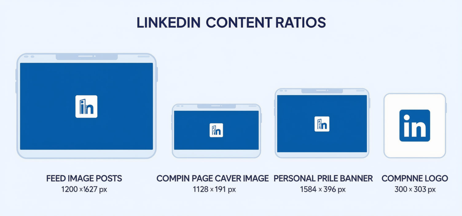
- Feed image posts: 1200 x 627 px
- Company page cover image: 1128 x 191 px — notably wide and short, which catches many designers off guard
- Personal profile banner: 1584 x 396 px
- Company logo: 300 x 300 px
YouTube
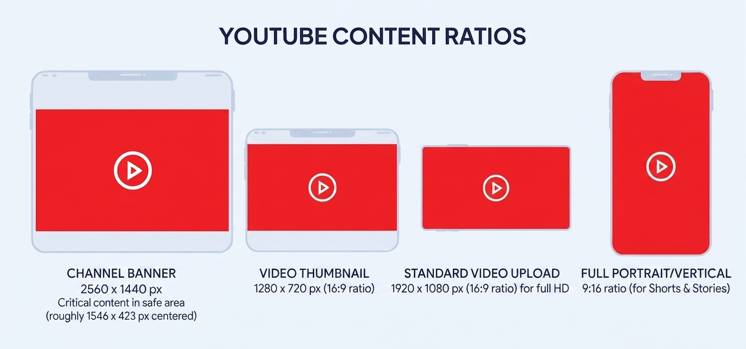
- Channel banner: 2560 x 1440 px, though the platform crops this differently across devices, so critical content should stay within the "safe area" of roughly 1546 x 423 px centered in the canvas
- Video thumbnail: 1280 x 720 px (16:9 ratio)
- Standard video upload: 1920 x 1080 px (16:9 ratio) for full HD
TikTok
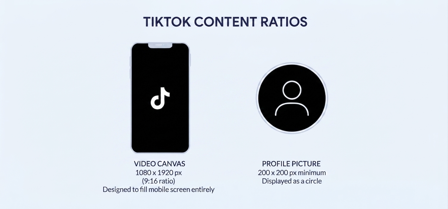
- Video canvas: 1080 x 1920 px (9:16 ratio), designed to fill a mobile screen entirely
- Profile picture: 200 x 200 px minimum
X (formerly Twitter)
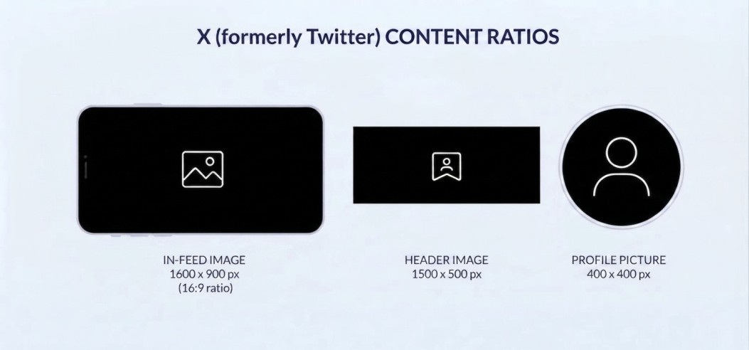
- In-feed image: 1600 x 900 px (16:9 ratio)
- Header image: 1500 x 500 px
- Profile picture: 400 x 400 px
Website and Digital Ad Placements
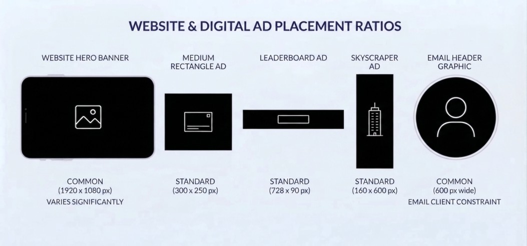
- Website hero banner: commonly 1920 x 1080 px or 1920 x 600 px depending on layout, though this varies significantly by site design
- Standard display ad (medium rectangle): 300 x 250 px
- Leaderboard ad: 728 x 90 px
- Skyscraper ad: 160 x 600 px
- Email header graphic: typically 600 px wide, since most email clients render at that constrained width regardless of screen size
Why These Numbers Aren't Arbitrary
It's worth understanding the logic behind these dimensions rather than just memorizing them, because platform specifications do shift over time, and understanding the underlying reasoning makes it much easier to adapt.
Aspect ratio reflects how a platform's layout works. Instagram Stories and TikTok use a tall, vertical 9:16 ratio because both formats are built for full-screen, one-at-a-time mobile viewing, held vertically. LinkedIn's cover image is unusually wide and short because it's designed to sit as a background strip behind a profile photo and headline, not as a standalone visual focal point. Pinterest favors taller images because its layout is a scrolling, masonry-style grid where taller pins simply occupy more visible space and tend to perform better within that specific browsing pattern.
Resolution standards reflect actual display density. Recommended pixel dimensions on most platforms account for the fact that many devices, particularly modern smartphones, have high pixel-density screens (often referred to as Retina or HiDPI displays) that render more actual pixels per inch than older standards assumed. Designing at the recommended resolution — rather than a lower one that happened to work fine years ago — keeps content looking sharp on today's screens.
Safe zones reflect where a platform's own interface sits. YouTube's banner safe zone exists because the same banner image gets cropped differently across desktop, tablet, mobile, and TV displays, and the safe zone is the one area guaranteed to remain visible regardless of which crop a given device applies. Similarly, Instagram Stories and TikTok both reserve space near the top and bottom of the frame for their own interface elements — profile info, captions, engagement icons — meaning critical text placed too close to those edges risks being covered.
How to Actually Design for Multiple Platforms Without Starting Over Every Time
Build From the Largest, Most Flexible Canvas First
A practical approach many designers use is starting with a large, high-resolution master canvas — often based on the most demanding size needed (commonly the vertical 9:16 Stories/Reels format, since it's the tallest, most constrained ratio in common use) — and designing key elements (logo, headline, focal image) in a way that can be recentered or reframed for other aspect ratios, rather than building every version as a completely separate design from scratch.
Design With Generous Margins Around Critical Content
Keeping essential text, logos, and focal points away from the very edges of a canvas — even on platforms without a strict, named "safe zone" — provides flexibility if a platform's cropping behavior changes, or if the same asset later needs to be repurposed for a slightly different placement than originally planned.
Use Templates Built Around Real Platform Specifications, Not Guesswork
Design tools like Canva, Adobe Express, and Figma maintain built-in templates matching current platform specifications, which removes the need to manually track every dimension across every platform — though it's still worth periodically verifying those specifications directly, since platforms do update their recommended sizes from time to time.
Export at the Right Resolution and Format for Each Destination
Beyond dimensions, matching the appropriate file format (JPEG for photographic content where smaller file size matters, PNG for graphics requiring transparency, and increasingly WebP for web use where efficient compression without visible quality loss matters) and resolution setting for each specific placement helps avoid both pixelation on one end and unnecessarily large file sizes on the other.
Preview Before Publishing Wherever Possible
Many platforms offer a preview step before a post or ad goes live — using it, rather than assuming a correctly sized canvas will automatically display exactly as designed, catches the occasional platform-specific quirk (an unexpected additional crop, an interface element sitting in an unanticipated spot) before it becomes visible to a real audience.
Examples
A restaurant's Instagram campaign initially used the same single 1080 x 1080 square image across Feed posts, Stories, and Facebook, reasoning that one well-designed graphic should work everywhere. On Stories, the square image appeared small, centered within a mostly empty vertical frame, ignoring most of the available screen space and looking noticeably less polished than competitors' full-screen vertical content. After building the campaign around a proper 9:16 vertical master design — with the Feed and Facebook versions cropped intentionally from that same design, rather than reused as-is — engagement on Stories content increased noticeably, largely because the content actually filled the screen the way viewers expected.
A B2B software company built a LinkedIn company page cover image using a standard 16:9 landscape photo, only to discover after publishing that LinkedIn's actual cover dimensions (1128 x 191 px) are dramatically wider and shorter than a standard photo ratio, resulting in most of their carefully chosen image being cropped out entirely, leaving only an awkward, off-center sliver visible. Redesigning specifically for LinkedIn's actual proportions — rather than assuming a standard image ratio would translate reasonably — solved the problem entirely.
An ecommerce brand running the same product photography across Facebook feed ads, Instagram Stories ads, and Pinterest Pins found that a single master image, when force-fit into Pinterest's strongly preferred vertical 2:3 ratio without any redesign, performed noticeably worse than a version specifically reformatted with additional vertical space and repositioned text — a difference the brand's team initially assumed was about the product itself, until testing revealed it was almost entirely explained by how awkwardly the original image had been cropped to fit Pinterest's actual layout.
Wrap-up
Canvas size is one of those foundational details that's invisible when it's done right and glaringly obvious when it's done wrong. A well-designed piece of content, built at the correct dimensions with real attention to aspect ratio, safe zones, and resolution for its specific destination, doesn't just avoid embarrassing crops — it takes full advantage of exactly how much space and attention that particular placement genuinely offers. Understanding these specifications isn't a rigid constraint on creativity; it's the actual canvas creativity has to work within, on every platform where a business's visual content ultimately gets seen.