


Case Study: Designing Premium Event Backdrops for Day of German Unity 2026





Case Study · Event branding & backdrop design · Bangkok, 2026
How Digital Agency Bangkok created two complementary backdrops for the German Embassy’s Day of German Unity reception, balancing national heritage, diplomatic elegance, and a large partner-logo system.
Project overview
Day of German Unity (Tag der Deutschen Einheit) marks German reunification. For the 2026 reception in Bangkok, the Embassy needed stage and entrance visuals that felt ceremonial and contemporary, while carrying German identity and a long list of corporate partners.
Digital Agency Bangkok designed two backdrops:
- Design 1: Main stage backdrop (inside the hall, on stage): a formal focus for official speeches and photography.
- Design 2: Photo wall backdrop (entrance area): optimised for guest photos and media coverage.
Publication note: This case study covers the approved backdrop designs only. Invitation artwork is not published, at the client’s request.
The challenge
A single composition had to balance several competing needs:
- German national identity
- Historical symbolism
- A prestigious celebration atmosphere
- Multiple corporate partner logos
- Strong event-title hierarchy
- A clean, elegant overall appearance
Too much heritage risked looking like a static poster. Too many logos risked looking like a trade-show wall. The design had to hold both.
Creative concept: “Unity Through Heritage”
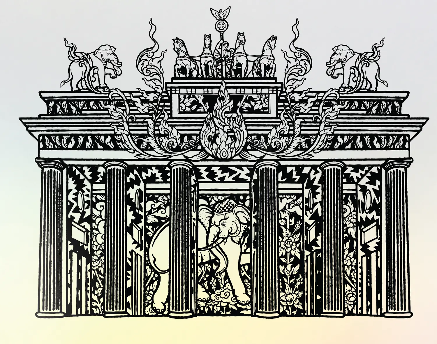
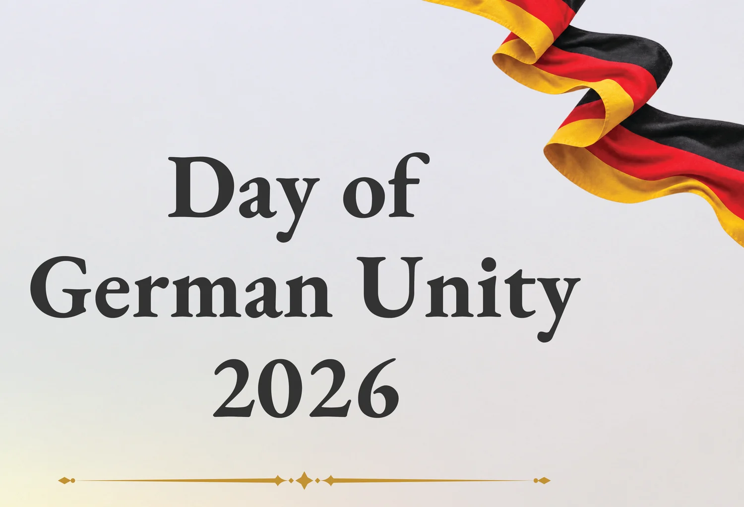
The visual language frames a contemporary celebration with German heritage. The Brandenburg Gate is the primary historical symbol, standing for Berlin, German history, and the reunification of East and West. Flowing German-coloured ribbons frame the composition and introduce national colour without flattening the centre into a flag graphic.
Concept keywords: Unity · Heritage · Celebration · Germany · Elegance · Partnership
Backdrop 1: Main stage
Goal: Formal, grand, and balanced for official speeches and ceremonies.
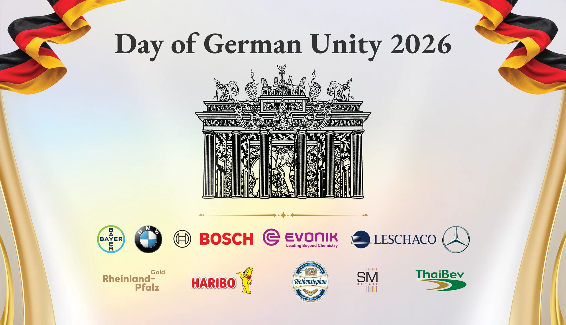
Approach: A symmetrical layout centred on the Brandenburg Gate for a strong, authoritative focus in stage photography.
- Top: German flag ribbons frame the composition
- Centre: the Brandenburg Gate as the primary symbol
- Below: partner logos in a structured partnership zone
- Background: soft white with subtle pastel light for a diplomatic, premium feel
Design message: “Germany at the centre, partnership around it.”
Backdrop 2: Photo wall
Goal: Optimised for guest photos and media coverage at the entrance.
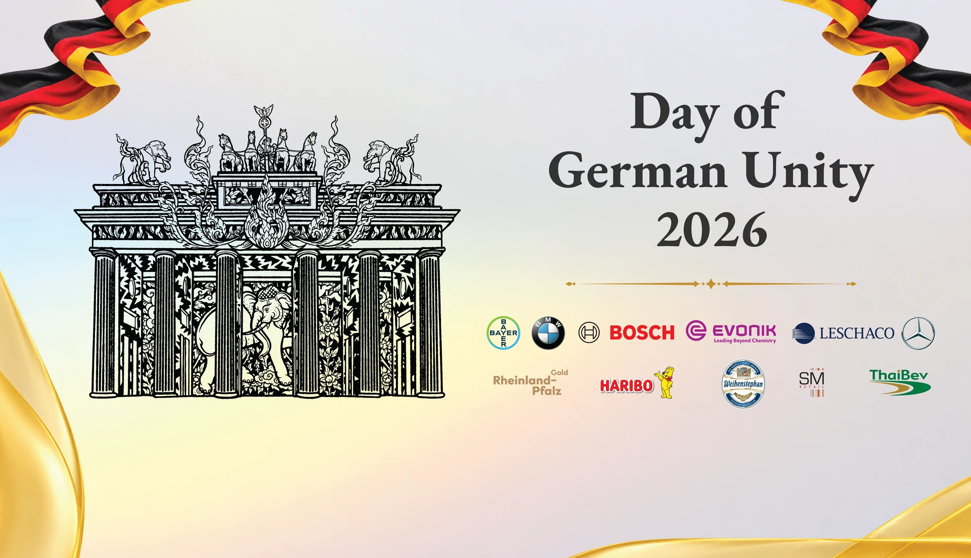
Approach: An asymmetrical composition, so titles and sponsor logos remain readable even when people stand in the middle of the frame.
- Left: Brandenburg Gate and heritage
- Right: event title
- Centre-right: partner ecosystem
- Background: the same soft white and pastel lighting system, for continuity
Design message: “German heritage on one side, modern partnership on the other.”
Colour strategy
- Black: German identity and authority
- Red: flag colour and energy
- Gold: celebration and prestige
- White: openness, unity, elegance
- Soft pastel lighting: modernises a traditional German visual identity for an event environment
Cultural symbolism
Why the Brandenburg Gate
It is not used only as architecture. It stands for Berlin, German history, division and reunification, national identity, and unity. That makes it the emotional anchor of the backdrop, and it is especially effective in a live event setting rather than on a static poster.
Why the flag ribbon
A flowing ribbon, instead of a flat flag, adds celebration, movement, dimensionality, framing, and stronger photographic impact under stage and entrance lighting.
Typography
The headline Day of German Unity 2026 uses a large classic serif to signal heritage, formality, prestige, historical importance, and a commemorative tone. It contrasts with the colourful ribbon, so the title stays the strongest text element.
- Event title: largest and strongest
- Brandenburg Gate: main symbolic visual
- Partner logos: supporting information with controlled weight
Sponsor and partner integration
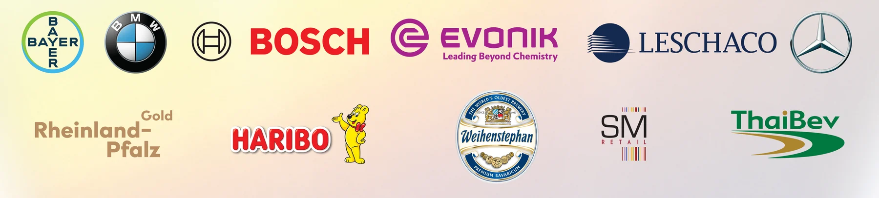
A large set of recognisable corporate identities had to appear without overpowering the event message. Logos sit in a dedicated lower band, organised in rows. That creates a clear split: event identity above, partnership ecosystem below. Unity is expressed not only culturally, but through collaboration.
Design exploration
An earlier direction used a more compact symmetrical layout, with the Gate centred and partners on a flag-coloured base. It established the visual language, but was refined for stronger hierarchy, more breathing space, and a clearer relationship between heritage, event information, and partners. That refinement led to the final main-stage and photo-wall pair.
Outcome
The two backdrops gave the reception a consistent, premium visual system: ceremonial on stage, practical for entrance photography, and respectful of German identity while making room for partners. The same language of Gate, ribbon, serif title, and structured logos tied the hall together without repeating a single rigid layout.
Need event branding, stage backdrops, or corporate visual identity in Bangkok?
Explore our graphic design services, corporate identity & branding, and banner & large-format design. See more work in our graphic design portfolio and other case studies such as Twinkid brand design.