

How to Build a Better Website with UX/UI Design

How to Build a Better Website with UX/UI Design
Two websites can look, at a glance, almost identical — similar color palettes, similar layout conventions, similar polish — and still perform completely differently once real visitors start using them. One converts smoothly, guides visitors naturally toward what they came for, and feels effortless to navigate. The other, despite looking just as attractive in a screenshot, quietly frustrates visitors in ways that never show up in a design review but show up clearly in the analytics: high bounce rates, abandoned forms, visitors leaving before finding what they needed.
The difference almost never comes down to visual talent alone. It comes down to process — whether the site was built through a deliberate UX (user experience) and UI (user interface) process, or whether it was designed working backward from what looks good rather than forward from what actually works. Good UX/UI isn't a single design skill; it's a sequence of distinct steps, each answering a different question about how real people will actually use the site. Skipping steps, or doing them out of order, is one of the most common reasons a visually appealing website underperforms.
This article walks through the actual sequence of UX/UI steps that go into building a genuinely good website — what each step accomplishes, why the order matters, and how these steps show up in real projects.
Understanding the Difference Between UX and UI
Before walking through the steps, it's worth being precise about a distinction that gets blurred constantly in casual conversation.
UX Is About the Experience; UI Is About the Interface
- UX (User Experience) concerns how a site functions — the logic of navigation, the flow from one step to the next, whether a visitor can accomplish their goal without confusion or friction. UX work happens largely before any visual design begins, and it's fundamentally about structure and behavior.
- UI (User Interface) concerns how a site looks and feels in direct, moment-to-moment interaction — the visual layout, color, typography, button styling, spacing, and the tangible details a visitor actually sees and touches. UI work builds on top of a UX foundation, translating the underlying structure into an actual visual experience.
A site can have excellent UI (beautiful, polished visuals) sitting on top of poor UX (confusing navigation, illogical flow) — and it will still frustrate visitors, because good looks can't compensate for a fundamentally confusing structure underneath. This is why the steps below move deliberately from UX foundations toward UI polish, rather than starting with visuals.
Step 1: Research and Understand the Actual Users
Why This Comes Before Any Design Work
Good UX/UI starts with understanding who the site is actually for and what they're trying to accomplish — not assumptions about what a "nice" website should look like in general. Skipping this step is one of the most common reasons a well-designed site still underperforms: the design solved a problem the actual users didn't have, or solved it in a way that didn't match how they actually think and behave.
What This Research Typically Involves
- Reviewing existing analytics (if the business already has a website) to understand where current visitors come from, what they engage with, and where they tend to drop off.
- Interviewing or surveying actual or prospective customers about their goals, frustrations, and expectations.
- Studying competitor sites, not to copy them, but to understand established conventions the target audience is already familiar with.
- Building user personas — simplified but grounded profiles representing the site's key visitor types and their distinct goals.
A healthcare clinic redesigning its website, for instance, might discover through this research that a large share of its actual visitors are anxious, first-time patients trying to quickly confirm whether the clinic treats their specific condition and how to book an appointment — a very different priority than the clinic's internal assumption that visitors mainly wanted to browse detailed information about the doctors' credentials. That single insight fundamentally reshapes what the homepage needs to prioritize.
Step 2: Define Clear Goals for the Site and for Each Key Page
Every website exists to accomplish something — generating leads, driving sales, building brand awareness, providing information efficiently. Before any structural or visual decisions get made, those goals need to be explicit, both at the site level and at the level of individual key pages, since a page without a clear intended outcome tends to end up unfocused no matter how well it's designed.
This step also involves defining what success actually looks like — a specific action (form submission, purchase, phone call) that indicates the page did its job — which becomes essential later for testing and refining the design after launch.
Step 3: Map the Information Architecture
What Information Architecture Actually Means
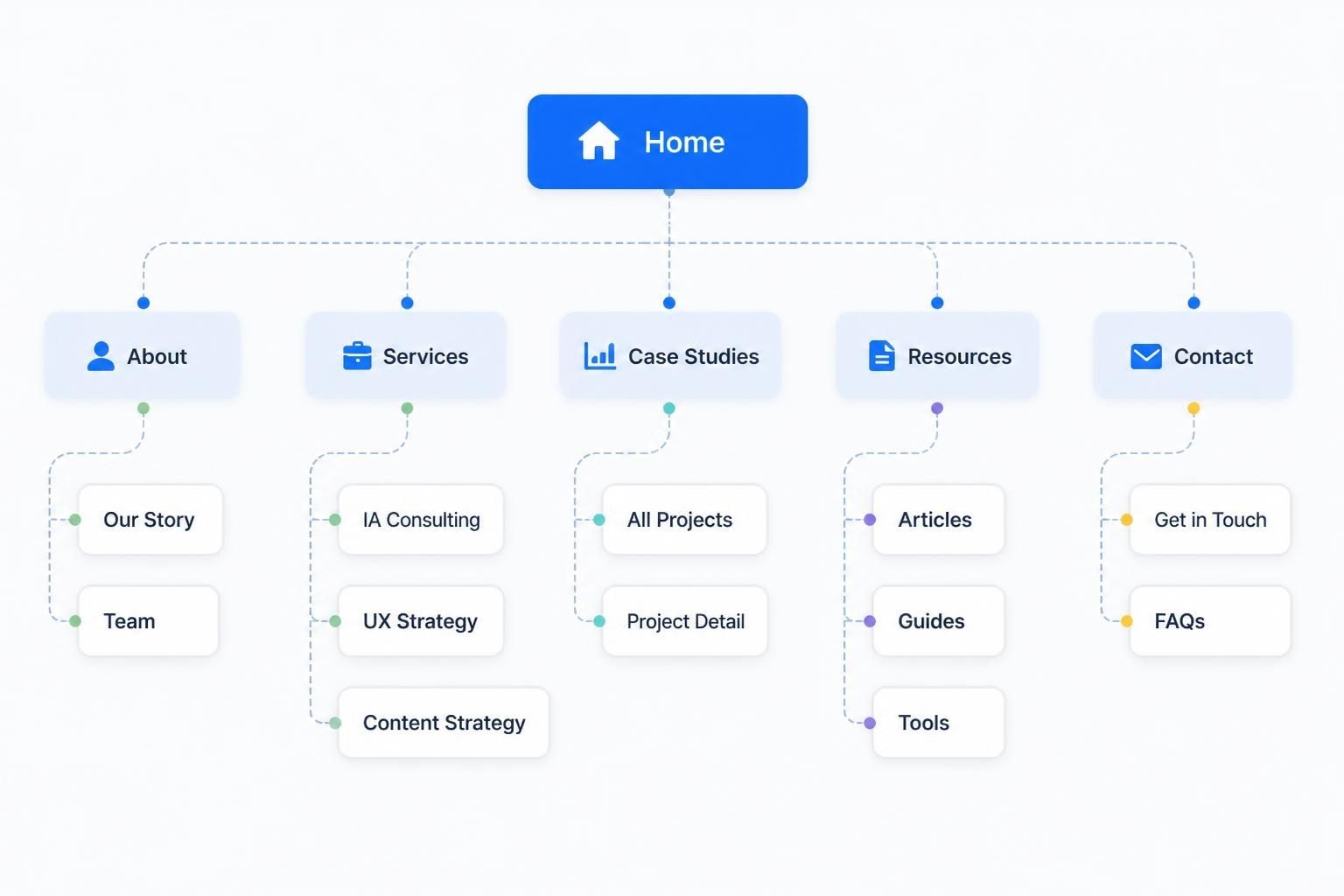
Information architecture is the underlying structural map of a website — what pages exist, how they relate to each other, and how a visitor moves between them. This step happens well before any visual design, and it's arguably the single most consequential UX step, since a poorly organized site structure creates confusion no amount of visual polish can fully fix later.
What This Step Typically Produces
- A site map outlining every planned page and how it connects to others.
- A defined navigation structure — what appears in the main menu, what lives in submenus, what's accessible only through internal links.
- A logical content hierarchy, ensuring the most important information isn't buried several clicks deep while less important content occupies prominent positions.
A real estate brokerage's site map, for example, needs to account for the fact that visitors arrive with genuinely different goals — some searching for a specific property type, some researching a specific neighborhood, some simply trying to find an agent's contact information — and the information architecture needs multiple clear paths accommodating each of those distinct goals, rather than forcing everyone through a single linear structure built around only one of them.
Step 4: Build Wireframes
Why Wireframes Come Before Visual Design
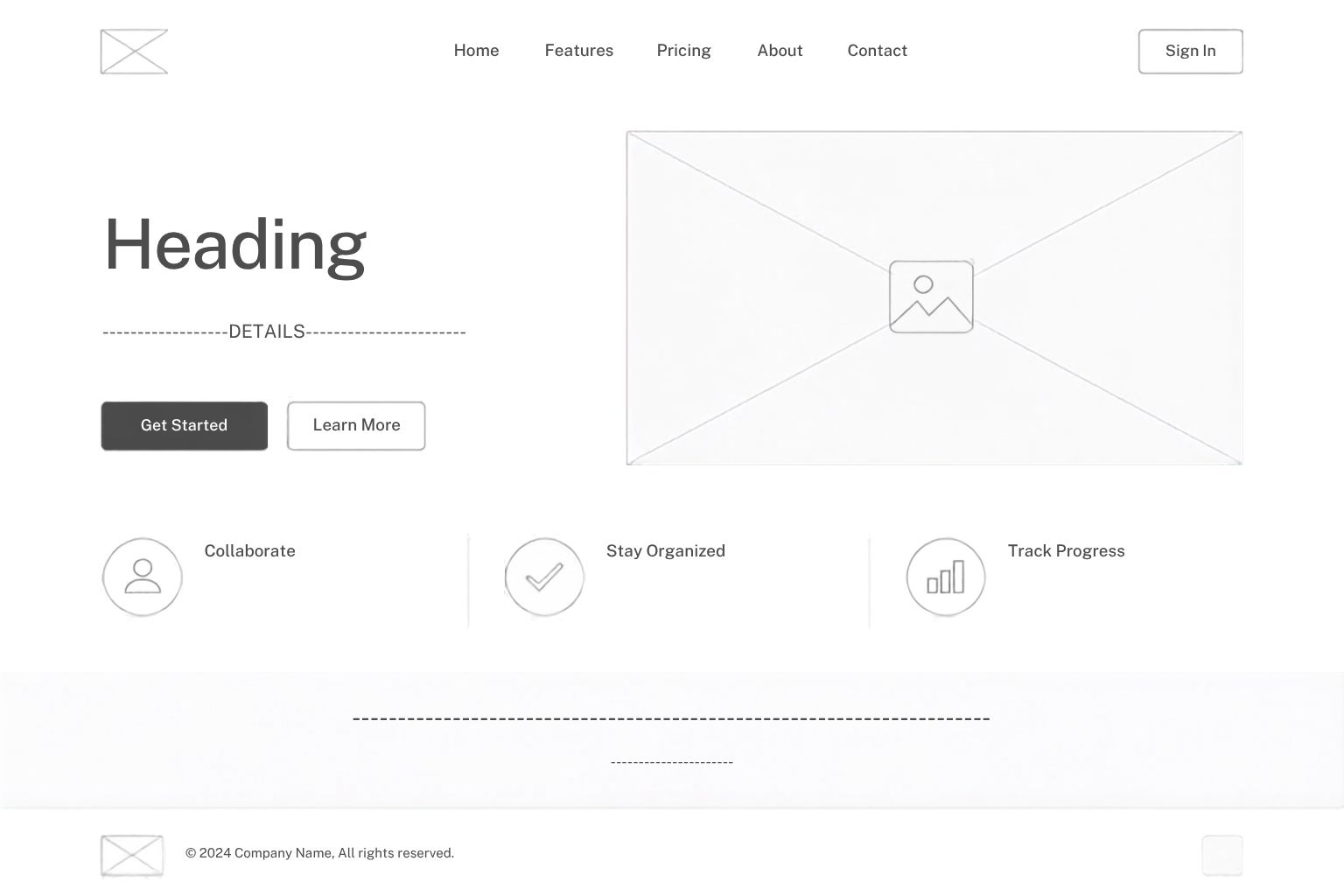
Wireframes are simplified, mostly unstyled layout sketches — usually black, white, and gray boxes and lines — representing where content and functional elements will sit on each page, without any real visual design applied yet. This step exists specifically to solve layout and functional questions before investing time in color, typography, and imagery, since layout problems are far cheaper and faster to fix at the wireframe stage than after full visual design work has already been built around a flawed structure.
What Wireframes Typically Address
- Where key content, calls to action, and navigation elements sit on each page.
- How much content different sections need to accommodate.
- The general flow a visitor follows moving through a page or a multi-step process, like checkout or a signup flow.
Wireframing a hotel booking page, for instance, forces early decisions about exactly where the availability search, room comparison, pricing, and booking button need to sit relative to each other — decisions that are much easier to test and adjust as simple boxes on a wireframe than after a fully designed, styled page has already been built around an unclear or awkward layout
Step 5: Design Prototypes and Test Them With Real Users
The Value of Testing Before Building
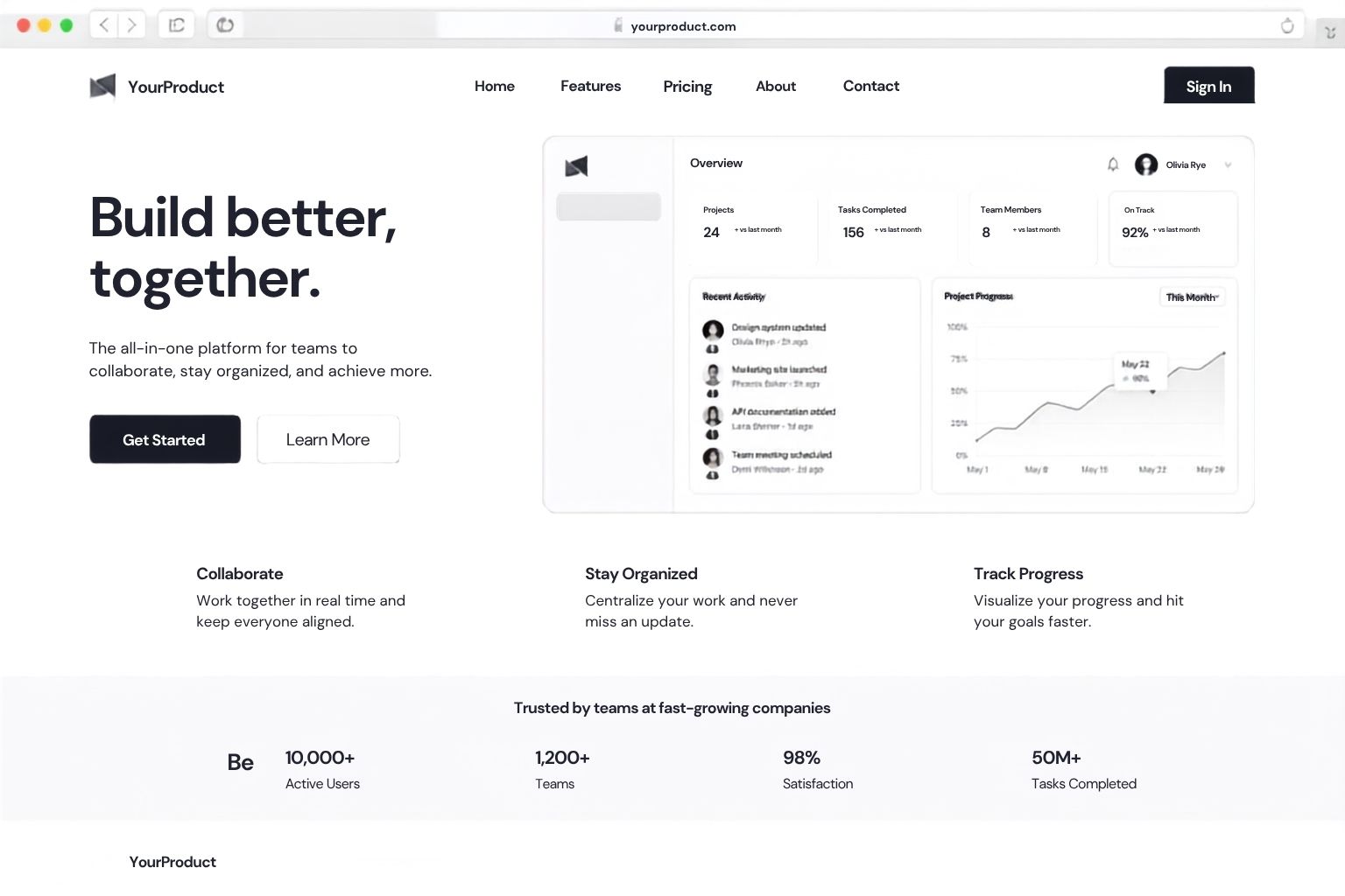
Once wireframes establish the basic structure, many UX processes move to interactive prototypes — clickable mockups that simulate real navigation and interaction without requiring actual development work yet. Testing these prototypes with real, representative users before committing to full development is one of the most valuable, and most frequently skipped, steps in the entire process, since it's dramatically cheaper to discover and fix a confusing flow at the prototype stage than after a site has already been fully built and coded.
What Usability Testing Typically Reveals
- Points where users hesitate, get confused, or take longer than expected to complete a task.
- Elements users expect to be clickable that aren't, or vice versa.
- Content or options users consistently overlook, even when it's technically visible on the page.
- Genuine confusion about site structure or terminology that wasn't apparent to the people who built the prototype, precisely because they already know how it's supposed to work.
An ecommerce brand testing a prototype checkout flow, for example, might discover that a meaningful share of test users abandoned the flow specifically at a step requiring account creation before completing purchase — a friction point the internal team hadn't flagged as a concern, since they were testing the flow already logged in, but one that becomes an easy, high-value fix (adding a guest checkout option) once identified through genuine user testing rather than internal assumption.
Step 6: Apply Visual Design (UI)
Moving From Structure to Actual Interface
With structure and flow validated through wireframing and testing, visual design work begins — applying color, typography, imagery, spacing, and the full visual identity of the brand to the validated structural foundation. This is the step most people associate with "web design" in casual conversation, but it's deliberately positioned after the structural work specifically so visual decisions build on top of a foundation already proven to function well, rather than visuals having to compensate for structural problems discovered too late.
Key UI Considerations at This Stage
- Visual hierarchy — using size, color, contrast, and placement to guide attention toward the most important elements on each page first.
- Consistency — applying a defined design system (consistent button styles, spacing, typography scale, color usage) across the entire site, so the experience feels coherent rather than assembled from disconnected parts.
- Accessibility — ensuring sufficient color contrast, readable font sizes, and design choices that remain usable for visitors with visual or motor impairments, which is both an ethical consideration and, in many regions, a legal one.
- Brand alignment — making sure the visual execution genuinely reflects the business's identity and positioning, not just generic, trend-driven design choices disconnected from what the brand actually stands for.
Step 7: Design for Responsiveness Across Devices
Why This Isn't a Separate, Optional Step
Since a large share of web traffic today happens on mobile devices, responsive design — ensuring layouts adapt cleanly across desktop, tablet, and mobile screens — needs to be considered throughout the design process, not bolted on as an afterthought once a desktop design is already finished. This often means designing mobile layouts alongside, or even before, desktop layouts, given how much traffic mobile represents for many businesses.
What Responsive Design Actually Requires
- Rethinking navigation for smaller screens, often collapsing a full desktop menu into a simplified mobile menu structure.
- Adjusting content priority for smaller screens, since less content can reasonably fit above the fold on mobile, requiring deliberate decisions about what appears first.
- Resizing tap targets (buttons, links) appropriately for touch interaction, since a target that's easy to click precisely with a mouse can be frustratingly small to tap accurately with a finger.
- Testing actual load performance on mobile networks, not just visual appearance, since mobile users are often on slower connections than the desktop environment a design might have been reviewed on.
Step 8: Build and Implement the Design
Once the design is finalized and tested, development translates the visual design into an actual functioning website — real code, real content management functionality, and real integration with any backend systems the site requires. Close collaboration between designers and developers during this stage matters significantly, since small implementation details (spacing, animation timing, interactive behavior) can meaningfully affect how faithfully the final built site reflects the intended UX and UI decisions made earlier in the process.
Step 9: Launch, Monitor, and Iterate
The Process Doesn't End at Launch
A genuinely good UX/UI process treats launch as a checkpoint, not a finish line. Once real visitors begin using the live site, actual behavioral data — heatmaps, session recordings, conversion tracking, analytics on where visitors drop off — provides a level of insight that even thorough pre-launch testing can't fully replicate, since it reflects real visitors in real, unprompted conditions rather than a testing scenario.
What Ongoing Iteration Typically Involves
- Reviewing analytics regularly to spot pages with unexpectedly high bounce rates or drop-off points in key conversion flows.
- Running A/B tests on specific elements — headlines, button placement, form length — to validate design decisions with real performance data rather than assumption alone.
- Continuing to gather qualitative feedback from actual users or customers after launch, not just relying on quantitative data in isolation.
- Revisiting and refining the design periodically as the business's goals, offerings, or audience evolve over time.
A subscription service launching a redesigned signup flow, for example, might find through post-launch analytics that a specific step in the flow has an unexpectedly high abandonment rate — information that wasn't apparent during pre-launch testing with a smaller group of testers, but becomes clear once a much larger, more diverse group of real prospective customers interacts with the live flow, prompting a targeted refinement to that specific step rather than a full redesign of the whole flow.